

A logo grid is a set of company marks arranged in even rows and columns on a slide, used in market maps and pitch decks to show competitors, portfolio companies or deal comparables at a glance. The fastest way to build one professionally is to use native picture objects, PowerPoint's Align and Distribute tools, and consistent padding, then export at high resolution. Rights clearance for every logo you include is your responsibility, not the slide template's.
TL;DR:
- Ensuring consistent padding across all logo tiles prevents the grid from looking sloppy, especially on larger or projectors.
- Choosing high-resolution SVG or PNG files and verifying export quality avoids blurry logos and maintains professionalism in presentations.
- Grouping logos after precise alignment and distribution helps create a clean, easily adjustable grid that responds well in different viewing conditions.
- Applying a logical ordering, such as largest revenue first or grouping competitors, visually communicates hierarchy without extra labels.
- Using logo databases or automation tools like Quikturn can significantly reduce search and sizing time, freeing analysts to focus on analysis rather than artwork.
Table of Contents
- A seven-step checklist for a pitch-ready logo grid
- PowerPoint commands that make grid-building fast
- Design rules that keep a logo grid legible
- Trademark and rights clearance before you hit send
- Where automation actually saves analyst time
- What consistently separates a clean grid from a rushed one
- Get your logo grids done without the manual search
- Where to check the details yourself
- Sources
- FAQ
A seven-step checklist for a pitch-ready logo grid
Most analysts eyeball logo placement, which is exactly why so many market maps look uneven under conference room lighting. A repeatable process fixes that.
- Gather assets first. Pull SVG or high-resolution PNG files for every logo; convert low-res JPEGs before you start placing anything.
- Decide the grid dimensions. Pick rows and columns based on logo count, then cluster companies by sector, deal stage or relevance rather than alphabetically.
- Set padding rules before placement. Choose one padding value for every tile instead of nudging logos by eye as you go.
- Select all logos and align them. Use Picture Format then Align to set vertical and horizontal position across the group.
- Distribute spacing evenly. Apply Distribute Horizontally or Distribute Vertically so gaps match, then decide whether you're aligning to the slide or to the selected objects.
- Group the finished grid. Select only the logo tiles, not placeholders or leftover text boxes, before grouping.
- Check the export. Confirm the slide exports at native resolution or high DPI, then zoom in at 200% to catch blur before you send the deck.
Skipping step three is the most common mistake. Padding that varies from tile to tile reads as sloppy even when every logo is individually sharp.
PowerPoint commands that make grid-building fast
PowerPoint's built-in alignment tools do most of the heavy lifting once you know which command to reach for. Select multiple logos with Ctrl or Shift, then work through Align and Distribute rather than dragging objects by hand.
- Use Align Top, Middle or Bottom for horizontal rows, and Align Left, Center or Right for vertical columns.
- Apply Distribute Horizontally or Distribute Vertically to equalize gaps once your outer logos are placed.
- Switch between Align to Slide and Align Selected Objects depending on whether you want the grid centered on the page or tight around the logos themselves; Microsoft's guidance on aligning objects covers both.
- Turn on Gridlines, Guides and Snap-to-grid for manual positioning, and let Smart Guides, the red dashed lines that appear automatically, handle relative alignment as you drag; both tools are detailed in Microsoft's guide to gridlines and snap-to-grid.
- Before grouping, open the Selection Pane to confirm you've caught every logo and nothing else.
Pro Tip: If grouping behaves inconsistently, convert any SVG logos to shapes first: mixed object types are the usual cause of grouping failures, according to Microsoft's guidance on grouping shapes and pictures.
Design rules that keep a logo grid legible
A grid that looks fine on your laptop can fall apart on a conference room projector or a printed handout. A few numeric defaults protect against that.
- Keep padding consistent across every tile rather than adjusting spacing logo by logo.
- Set a practical minimum logo width, roughly 100 to 150 pixels wide on a standard 16:9 slide, and test it by viewing the slide at actual size on a second monitor or projector.
- Match tile backgrounds to the slide: white or transparent tiles on a light slide, and reversed or white-knockout versions of logos on a dark one.
- Group logos by category, sector or deal type, and add a short caption or legend when the grouping logic isn't obvious at a glance.
- Standardize on monochrome or single-color logo versions when a market map has too many competing brand colors fighting for attention.
Ordering matters as much as spacing. A logo grid that runs largest-revenue-first, or groups direct competitors before adjacent players, communicates hierarchy without a single word of text.
Trademark and rights clearance before you hit send
Including a company's logo in a commercial pitch deck is not automatically covered by fair use, and clearance is the deck creator's job, not something a template handles for you. WIPO's guidance on rights clearance notes that descriptive or nominative use, simply naming a company by displaying its mark in a neutral market map, is often acceptable, but that acceptability narrows fast once the material has commercial effect.
- Never arrange logos in a way that could be read as an endorsement or partnership that doesn't exist.
- Add a short disclaimer line, such as noting that logos are property of their respective owners and shown for identification only, on any slide leaving your building.
- Remove a logo or seek formal permission when the deck involves a sensitive client situation, a competitive bid or use of a registered emblem rather than a plain wordmark.
- When a use case is borderline, involve legal review rather than guessing; WIPO's joint recommendation on marks and signs explains how commercial effect is judged and why context changes the answer.
Where automation actually saves analyst time
Most of the checklist above is mechanical, and that's exactly what Quikturn was built to remove. The platform runs on a verified database of over 17 million company logos and connects to your deck through a web app, a PowerPoint add-in or an API, so the search-and-insert step never leaves the slide you're working on, as described on the Quikturn platform page.
- Logo search by company name, ticker or domain replaces manual image hunting across company websites and press kits.
- Consistent sizing and formatting on insertion means fewer padding mismatches to fix by hand afterward.
- High-resolution exports go directly into native PowerPoint format, which sidesteps the blurry-export problem covered in Quikturn's guide to fixing blurry logos.
- Enterprise-grade security with no storage of presentation content fits the compliance expectations of banking and consulting teams.
A practical workflow: find and insert logos through Quikturn, then finish with Align and Distribute in PowerPoint for final polish, then export. The search and insertion steps are the ones a query system handles well; the last few pixels of spacing are still worth a human glance. Investment banking teams can see how this maps to deal workflows on the investment banking solutions page.
What consistently separates a clean grid from a rushed one

The habit that saves the most time isn't a PowerPoint trick, it's building a reusable logo master slide or library per deal team, so nobody re-sources the same twenty logos three decks in a row.
A few defaults are worth adopting outright: 8 to 12 pixels of padding between tiles, a minimum logo width around 120 pixels on a 16:9 slide, and monochrome versions whenever a market map exceeds about fifteen companies. The bigger trade-off is choosing fewer, higher-quality logos over cramming every possible competitor into one crowded tile. A grid with twelve sharp logos reads better in a room than one with thirty blurry ones, and it takes less time to defend when a partner asks why a name is missing.
— Quikturn Team
Get your logo grids done without the manual search
Some platforms turn the slowest part of this process, finding and sizing logos, into a query instead of a scavenger hunt, so your team spends its time on the analysis instead of the artwork.
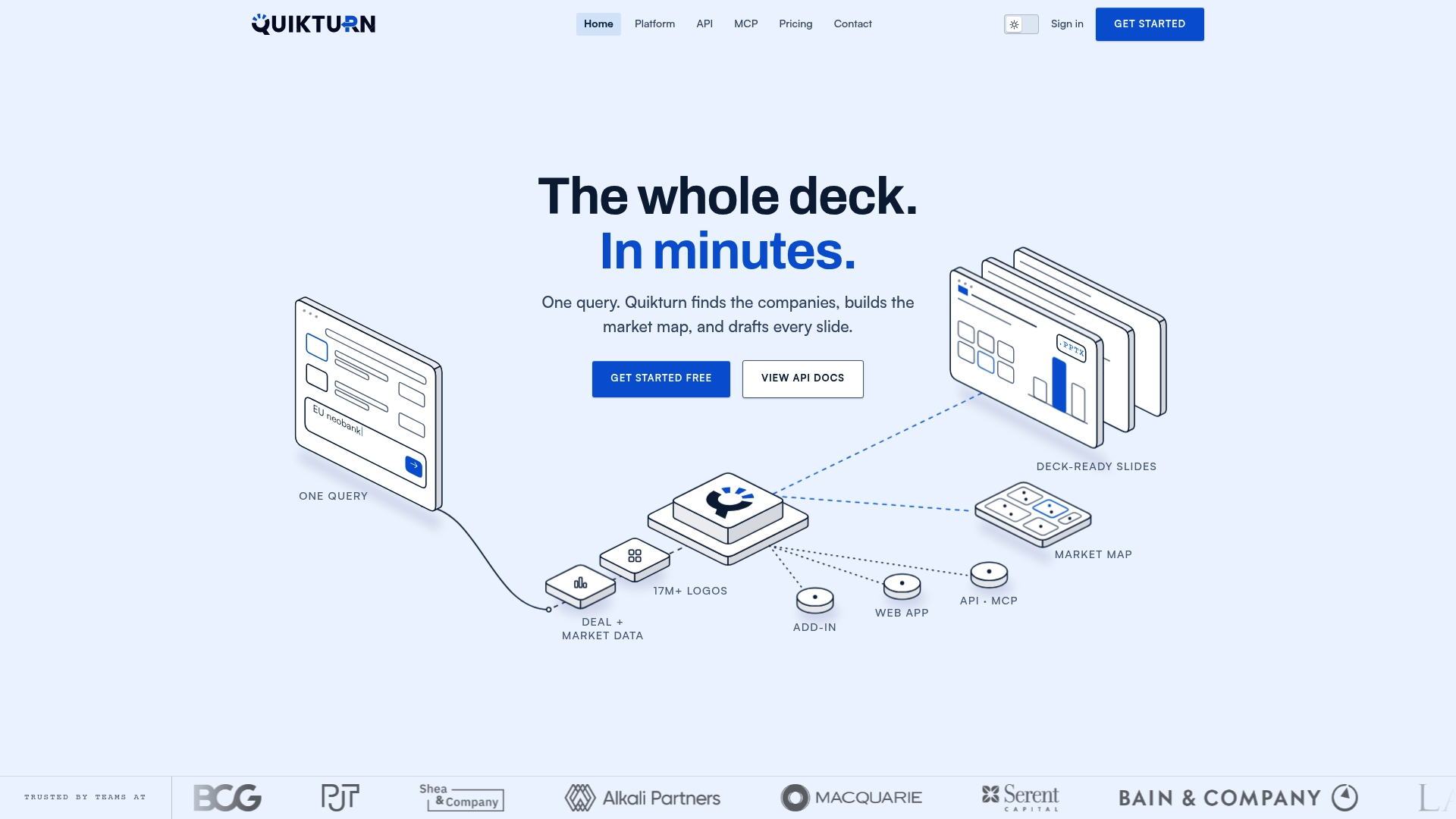
Some platforms feature databases of millions of company logos, helping users avoid searching company press pages for usable logo files. For consulting teams building client-facing decks repeatedly, the consulting solutions page walks through the same workflow applied to client work. Start with the free plan or explore pricing to see which tier fits your deal volume.
Where to check the details yourself
- Microsoft: Align and Distribute training, gridlines and snap-to-grid, grouping objects.
- WIPO: rights clearance guide.
- For deeper branding groundwork, Proud Lion Studios covers foundational branding and logo design practices.
Sources
- Guides for arranging things on a slide | Microsoft Support
- Work with gridlines and use snap-to-grid in PowerPoint | Microsoft Support
- Group or ungroup shapes, pictures or other objects | Microsoft Support
- Rights clearance: A guide for independent filmmakers — WIPO
FAQ
What is the minimum logo size for a pitch deck slide?
A practical baseline is a logo width that ensures legibility on a standard 16:9 slide, tested by viewing the slide at full size on a second monitor or projector. Anything smaller tends to lose legibility once the room lighting or projector resolution isn't ideal.
How do I stop logos from looking blurry after exporting?
Blurriness usually comes from starting with a low-resolution image or scaling a small logo up past its native size. Use vector formats like SVG where possible, and check the export at 200% zoom before sending the deck, as covered in Quikturn's guide to fixing blurry logos.
Is a disclaimer enough to use company logos in a deck?
A short disclaimer noting that logos belong to their respective owners reduces the risk of implying endorsement in a neutral market map, according to WIPO's guidance. It does not replace formal permission once the use has real commercial effect, so borderline cases still call for legal review.
Should I align logos to the slide or to each other?
Use Align to Slide when you want the whole grid centered on the page, and Align Selected Objects when you want the logos tightly aligned to one another regardless of where the group sits. Both options are available in PowerPoint's Align and Distribute menu.
Can Quikturn insert logos directly into PowerPoint?
Yes, Quikturn works as a PowerPoint add-in as well as a web app and API, letting you search and insert logos from its verified database directly into a slide, as detailed on the platform page. From there, final spacing adjustments still happen through PowerPoint's own Align and Distribute tools.