

A logo wall should work as a curated trust signal, not a logo dump: use a concise grid of several logos or a controlled carousel, build it once in Slide Master, and confirm permission before you present it. Put a short, high-impact lineup on a title slide, a smaller repeating version in a footer or corner, and save a carousel for mobile decks or large portfolios. Always pair the visual with real alt text and a documented permission trail.
TL;DR:
- Use a small, curated set of relevant logos with clear permission and accurate, verifiable references to build trust effectively.
- Implement static grids for five to ten logos or larger carousels with accessibility features such as pause controls for mobile presentations.
- Place logos in Slide Master to ensure consistency across slides and insert SVG files for scalable, high-quality images without pixelation.
- Always obtain written permission, record approved usage details, and keep logo assets updated to avoid legal issues and preserve credibility.
- Limit repeated decorative logos to a small, consistent size and default to grayscale, revealing color only on hover or in key moments.
Table of Contents
- Three Ready-to-Use Logo Wall Templates
- How Much Space Should a Logo Wall Occupy?
- Building a Logo Wall in PowerPoint or Google Slides
- What Permissions Do You Need Before Publishing a Logo Wall?
- A Practical Workflow for Finance and Consulting Teams
- Why Most Logo Walls Undersell the Companies on Them
- Build Your Logo Wall Faster With Verified Logos
- FAQ
- Sources
Three Ready-to-Use Logo Wall Templates
Pick a template based on how many logos you have and where the slide sits in your deck.
Template A: Curated static grid. This fits best when you have 5 to 10 high-quality logos and want a clean, scannable block. Arrange logos in two or three rows with even horizontal and vertical gaps, about a few millimeters to half an inch, so no logo touches another. Align every logo to the same baseline and cap height so a tall rectangular mark and a square mark read as the same visual weight.
Template B: Co-branded cover. Reserve this for a title slide where one or two partner or client logos need maximum visibility. Center the logos, size them at 2 to 4 inches tall, and pair them with your own logo at a matching scale so neither reads as dominant.
Template C: Horizontal carousel. This suits mobile decks or dense portfolios where a static grid would force tiny, unreadable marks. Carousel builders recommend pause-on-hover controls and responsive breakpoints so the row stays readable on a phone screen and doesn't auto-scroll past a viewer's attention, though that convenience comes at some cost to accessibility compared with a static grid.
A curated, verifiable lineup placed near a conversion point builds more trust than a crowded wall of logos buried below the fold, according to guidance on social proof walls. Relevance and verification matter more than volume.
For alt text, write a plain description such as "Acme Corp logo" for informative instances, and leave decorative repeats empty so screen readers don't repeat the same name on every slide. Where you have a case study or press mention tied to a logo, link it directly from the slide notes or a footnote so the claim carries its own proof.

How Much Space Should a Logo Wall Occupy?
A few measurements keep a logo wall legible instead of cluttered.
- Footer or corner logos: keep them small and consistent in height across every slide where they appear.
- Cover-slide logos: 2 to 4 inches tall is the exception that signals importance.
- Repeated logo blocks should generally occupy only a small fraction of total slide area to avoid competing with your content.
- Curate to several logos per slide, prioritizing recent, verifiable relationships over outdated or irrelevant ones.
- Drop any logo tied to an expired contract, a disputed relationship, or a client who never confirmed use.
Grayscale by default, with color appearing only on hover or in a single accent moment, keeps a dense wall visually calm while still letting viewers recognize each brand. Preserve original brand colors only on a cover slide or in a single-logo co-branding moment where color is the point.
Pro Tip: Run a dense logo wall past a colleague unfamiliar with the deck; if they can't name three logos in five seconds, cut the count or increase the spacing.
For accessibility, mark decorative repeated logos with empty alt text, write real alt text for any logo that carries unique information on that slide, and make sure carousel next and previous controls are reachable by keyboard tab order, not just mouse hover.
Building a Logo Wall in PowerPoint or Google Slides
- Open Slide Master and place your logo wall there first, not on individual slides. A single edit then propagates everywhere the layout is used, which is the fastest way to keep sizing and spacing consistent across a long deck, and it keeps your alt text management in one place rather than scattered across dozens of slides.
- Insert logos as SVG whenever the source file is available; vector files scale cleanly on a projector or a 4K monitor without pixelating, which presentation guides consistently recommend over raster formats for anything that gets resized.
- When only a PNG exists, export at a resolution well above your intended display size and confirm the background is transparent before placing it on a colored slide.
- Reserve Morph transitions and staggered reveals for logos that genuinely benefit from motion, such as a cover-slide reveal, and keep a static fallback for any audience member relying on reduced-motion settings.
- Before sending the deck, run an export checklist: confirm file size is reasonable for email, fonts are embedded, and the logo wall still reads clearly on both a small laptop screen and a projector.
What Permissions Do You Need Before Publishing a Logo Wall?
Using a client or partner logo without checking your agreement is one of the fastest ways to create legal friction or lose credibility with that client.
- Check the service agreement, NDA, or marketing release first; many already specify whether and how a logo can be used.
- When nothing is specified, send a short, direct permission request and keep the reply on file.
- Record the approved color variant, minimum size, and any exclusions the client requested.
- Store that permission note in the same project folder as your slide assets so a future version of the deck doesn't accidentally violate it.
Legal guidance on using client logos recommends explicit written permission and adherence to each client's brand guidelines rather than assuming reuse is fine because the relationship is public. An internal update to a team that already knows every client by name can often skip the logo wall entirely.
A Practical Workflow for Finance and Consulting Teams
Building a logo wall by hand, screenshot by screenshot, is where most pitch decks lose time and where low-resolution or outdated logos sneak in. We built our logo finder and PowerPoint add-in around a verified database of more than 17 million company logos so a consultant or banker pulls a current, high-resolution mark instead of whatever a search engine happens to surface.
- Prepare assets first: pull verified logos by company name, ticker, or domain rather than screenshotting a website.
- Verify permissions second: confirm each logo's approved use before it goes anywhere near a client-facing deck.
- Drop into Slide Master third: place the approved set once, attach any case-study or provenance links in the notes, and let the master layout carry it across the deck.
Teams preparing pitch materials for investment banking engagements use this sequence specifically because a wrong or outdated logo in front of a prospective client is a credibility problem, not just a design one.
Why Most Logo Walls Undersell the Companies on Them

The common advice on logo walls stops at "don't use too many logos," which is true but incomplete. The bigger failure is treating the wall as decoration instead of evidence. A logo by itself tells a viewer almost nothing; a logo attached to a one-line outcome or a case study link tells them something they can verify. Pairing a curated grid with annotated proof points reduces skepticism more effectively than the logos alone, according to research on credibility design, and that pairing is the part most templates skip.
The second underrated priority is maintenance. A logo wall built once and never revisited accumulates expired relationships and outdated marks, which quietly undercuts the trust it was meant to build. Before polishing spacing or picking a carousel animation, confirm every logo on the slide is current, permitted, and still relevant. Get that right first, then worry about grid alignment.
— Quikturn Team
Build Your Logo Wall Faster With Verified Logos
We give finance and consulting teams a shortcut around the slowest part of this process: hunting down a client's current logo in the right format. Our platform pulls from a verified database of over 17 million company logos, so you can search by name, domain, or ticker and drop a clean, high-resolution mark straight into Slide Master through our web app, PowerPoint add-in, or API.
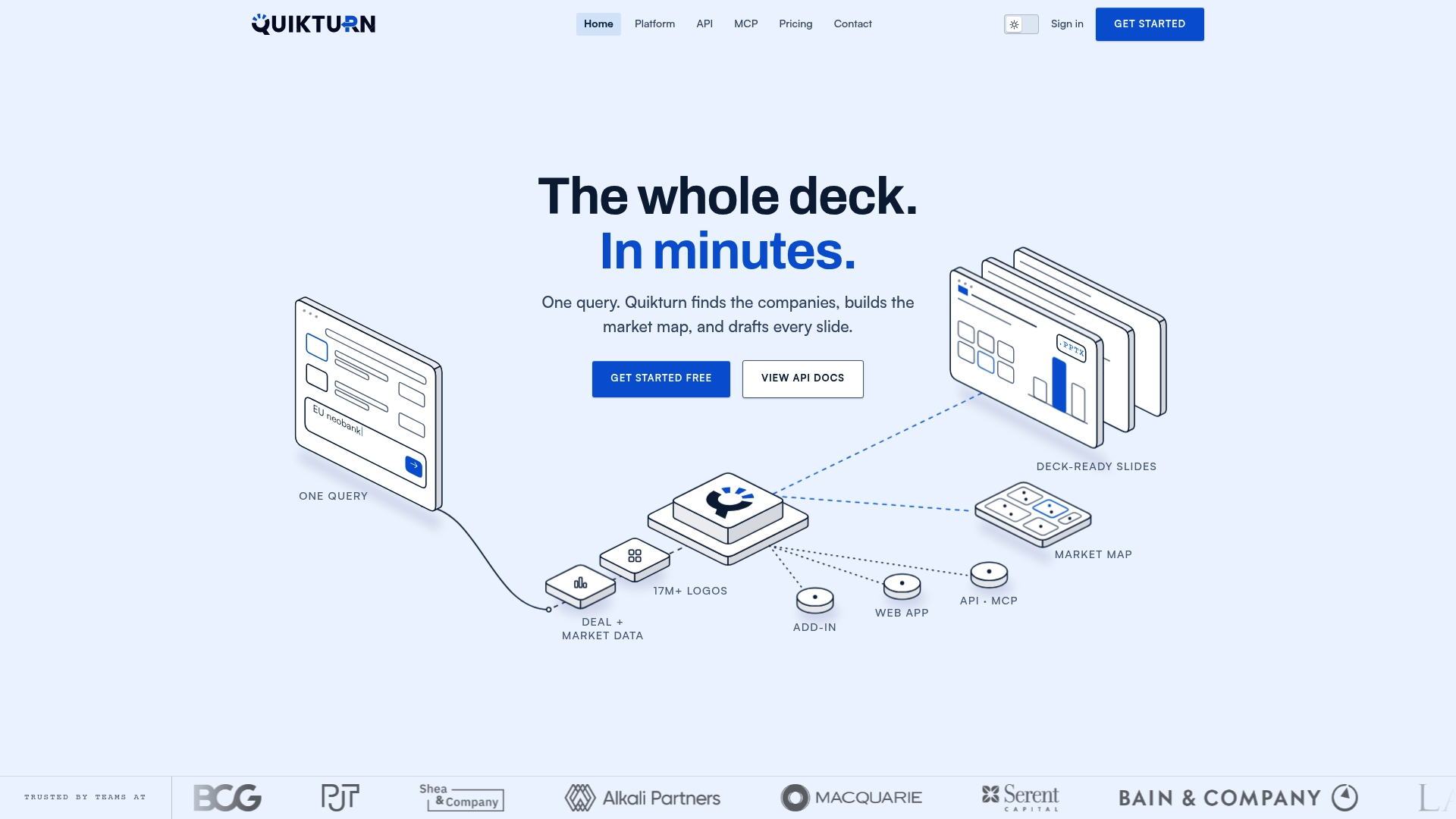
Our Platform Pro plan runs $9.99 per month or $89 per year, and a free tier is available for lighter use. Try the logo finder on your next deck and see how much time it saves over manual searches.
FAQ
What size should logos be on a presentation slide?
Footer or corner logos should be small and consistent in height across every slide where they appear, while a cover slide can go larger, up to 2 to 4 inches, to signal a featured partnership. Repeated logo blocks should generally occupy only a small fraction of total slide area to avoid competing with your content, as recommended in presentation design guidance.
Do I need permission to use a client's logo in a presentation?
Yes, check your service agreement, NDA, or marketing release first, since many already specify allowed use. When nothing is specified, legal guidance recommends sending a direct written request and keeping the approval on file before the logo appears anywhere client-facing.
How many logos should a logo wall include?
Most guidance points to 5 to 10 curated logos rather than every logo you can find, since a crowded, uncurated wall reads as less trustworthy than a short, relevant lineup. Prioritize recent, verifiable relationships over older names that may no longer be accurate.
Should I use a static grid or a carousel for my logo wall?
A static grid works well when you have a manageable set of logos and want them all visible at once, while a carousel suits mobile decks or large portfolios where space is limited. Carousel guidance recommends pause-on-hover controls and responsive breakpoints, since carousels trade some accessibility for space efficiency.
Can Quikturn help me find and insert verified company logos?
Yes, our logo finder searches a verified database of more than 17 million company logos by name, domain, or ticker, and our PowerPoint add-in lets you insert them directly into Slide Master. A free tier is available, with Platform Pro starting at $9.99 per month for heavier use.
Sources
- Navigating the risks and legalities of using client logos and trademarks in marketing materials
- Accessibility Development Staging | PowerPoint Slide Master
- Build a social proof wall that builds trust: As seen on examples
- How to Use Company Logos in Presentations: A Complete Guide
- Logo Carousel Builder - Client Logo Sliders | Swiper Studio