
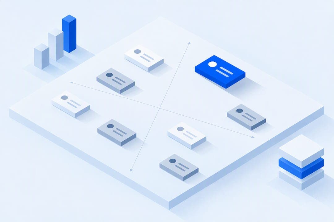
A market landscape slide has one job: show who else is solving the problem you solve, and why you will win anyway. The two formats that cover most pitch situations are a positioning map, for visual, two-axis comparisons, and a feature matrix, for detailed, line-by-line differentiation. Pick one of those to start, then read on for the selection logic, data sources, and templates that make either format hold up under investor questions.
TL;DR:
- Use a positioning map for quick reads or a feature matrix for detailed analysis, selecting the format based on your audience and data availability.
- Keep the landscape slide simple, with one clear message, a few competitors, and strong evidence points like pricing or customer logos.
- Gather verified data from public filings, market reports, competitor websites, and customer interviews, including timestamped screenshots for accuracy.
- Prepare a comprehensive appendix with feature comparisons, pricing, and customer details to support your claims during investor Q&A.
- Automate logo and data collection with tools like Quikturn to speed up creation and ensure branding consistency.
Table of Contents
- Why investors and stakeholders expect this slide
- Choosing a format: positioning map, Venn, feature matrix, or quadrant chart
- How to pick the right format for your audience and stage
- What data to put on the slide, and where to find it
- Designing and presenting the slide so it lands
- Templates you can fill in 10 to 30 minutes
- Backing up your slide with a strong appendix
- How Quikturn speeds and safeguards market-slide creation
- What experienced teams do differently on this slide
- Build your landscape slide faster with verified data
- FAQ
- Sources
Why investors and stakeholders expect this slide
Every market landscape slide exists to answer a single question an investor will eventually ask out loud: who else is solving this, and why will you win? Sequoia Capital's guidance on pitching investors frames this directly, noting that founders need to identify direct, indirect, replacement, and potential competitors, not just the two or three names that come up in casual conversation. Skipping that breadth is one of the fastest ways to look naive about your own market.
The bar shifts depending on who is in the room. A venture partner meeting often happens early in a pitch sequence, and Sequoia notes that the opening slides, including market signals, carry outsized weight in how an investor judges your thinking in the first few minutes. An internal executive review tends to assume shared context, so the same slide can move faster and lean more on strategic implications than on defining the category from scratch.
This slide is essential whenever you are asking someone to commit capital, headcount, or a strategic bet based on your view of the market. It can be condensed, sometimes to a single callout box inside a bigger strategy slide, when the audience already agrees on who the competitors are and the only open question is execution. The deciding factor is whether your audience needs convincing that you understand the competitive terrain, not whether a landscape slide looks customary for the deck type.

Choosing a format: positioning map, Venn, feature matrix, or quadrant chart
The format you pick should match the point you are making, not the template that looks most polished. Each of the four common layouts trades simplicity for nuance in a different way.
A two-by-two positioning map plots competitors across two axes, such as price and feature depth, and makes your relative position visible in one glance. It works well for investor meetings where you need a fast, memorable read, but it flattens any competitor with more than two meaningful dimensions into a single dot, which can invite the question "where's the third axis?"
A Venn diagram shows overlapping categories, useful when your product sits at the intersection of two markets that rarely compete directly, such as payroll software and compliance tools. It communicates category-blending well but gets unreadable past three circles, so it rarely survives a crowded market.
A feature matrix lists competitors as rows and capabilities as columns, checkmark by checkmark. It holds up best under detailed Q&A because every claim is traceable to a specific row, but it reads as dense and can bury your actual differentiation in a wall of checkmarks if you include too many features.
A ghost or ranked quadrant map groups many competitors into shaded tiers or categories rather than plotting each one individually, borrowing from the kind of portfolio thinking in Strategyzer's business portfolio map, which separates initiatives by maturity and resource allocation rather than by a single metric. It is the most scalable option when you are up against a dozen or more players, since grouping legacy competitors into category buckets lets you stay comprehensive without naming every one.
Quick reference for what each format trades off:
- Positioning map: fast to read, weak on more than two dimensions.
- Venn diagram: clear for category overlap, unreadable past three circles.
- Feature matrix: defensible in detail, risks visual clutter.
- Quadrant or ghost map: scales to many competitors, loses individual nuance.
How to pick the right format for your audience and stage
Four variables decide which format earns its place on the slide: who is in the room, what stage your company is at, how much verified data you have, and how complex your differentiation story is. A seed-stage founder with three known competitors and thin data should lean toward a simple positioning map. A later-stage company walking a board through a crowded category has both the data and the obligation to go deeper with a feature matrix or quadrant map.
A three-step flow keeps the decision simple regardless of stage:
- Define your message first. Write the one sentence you want the audience to remember, such as "we're the only option built for mid-market compliance teams," before touching a template.
- Pick the simplest format that still supports that sentence. If a positioning map makes the point, do not reach for a ten-row feature matrix just to look thorough.
- Anchor the slide with one or two evidence points. A pricing comparison, a customer logo, or a named channel partnership turns an opinion into a claim someone can check.
In practice, a seed-stage founder pitching a VC partner meeting usually wins more trust from a clean positioning map paired with one sharp evidence point than from an exhaustive matrix the audience has no time to parse. A Series A investor doing deeper diligence will often want the feature matrix as a follow-up, even if the live pitch opens with the simpler map. A CFO or board member evaluating a build-versus-buy decision tends to want the matrix from the start, since their decision hinges on specific capability gaps rather than overall market positioning.
What data to put on the slide, and where to find it
A defensible landscape slide needs a short, consistent set of fields for every competitor you include: name, logo, a category bucket, a one-line status (funded, acquired, legacy, emerging), and one or two evidence items such as pricing, named customers, or distribution channel. Skipping the evidence items is the single biggest reason these slides collapse under questioning.
Reliable sources for filling those fields include:
- Public filings and press releases for funding, acquisition, and leadership changes.
- Market reports and analyst coverage for category sizing and growth trends.
- Competitor product and pricing pages, checked directly rather than from memory.
- Customer interviews, which surface perceived differentiation that a spec sheet never will.
- Investor-facing writing, including Sequoia's pitch guidance and First Round Review's reporting on seed-stage pitches, for how investors expect this information to be framed.
One large, well-prepared appendix often matters more to investors than a polished main slide, since First Round Review's reporting on seed-stage pitch meetings notes that founders who arrive with granular backup data, including feature comparisons, pricing comps, and cohort analysis, move through diligence faster. That means the real work happens before the meeting, not during it.
Verification matters as much as collection. Timestamp every pricing or feature claim, since competitor pricing pages change without notice, and keep the raw screenshots or notes in your appendix so you can answer "where did you get that" without hesitating.
Designing and presenting the slide so it lands
A landscape slide earns its place only if the room can read it in ten seconds and remember the takeaway an hour later. That means one message per slide: resist the urge to show every competitor, every feature, and every axis at once. A crowded slide reads as insecurity about your position, not thoroughness.
Four practical rules keep the slide clean:
- Use a readable font size for every label, even competitor names you expect the audience to recognize instantly.
- Treat every logo the same way: consistent sizing, consistent background, consistent alignment, so no single competitor looks more or less important by accident.
- Label both axes of a positioning map explicitly, including the direction that favors you, so nobody has to guess which corner is "good."
- Write a one-line takeaway either on the slide or as your spoken anchor, something like "we're the only platform built specifically for this workflow," so the visual supports a sentence rather than replacing one.
When you present the slide, say the takeaway before you walk through the details, not after. If someone pushes back with "what about [competitor]," answer briefly from the main slide and then offer to pull up the appendix rather than relitigating the whole landscape live. That single move, deflecting detail to backup material instead of improvising, is often what separates a founder who looks prepared from one who looks caught off guard.
Pro Tip: Rehearse the one-line takeaway out loud until it takes under eight seconds to say; if it takes longer, the slide is probably trying to make two points instead of one.
Templates you can fill in 10 to 30 minutes
A small set of templates covers nearly every pitch scenario, and each one can go from blank to presentable in under half an hour if your data is already collected.
- Positioning map: two axes, your logo plus 4 to 8 competitors, best for a fast investor read.
- Feature matrix: competitor rows, capability columns, best for board or diligence conversations.
- Venn diagram: two or three overlapping circles, best when you sit between established categories.
- Timeline plus map: a market-evolution timeline paired with a positioning snapshot, best for showing how a category has consolidated or shifted.
For a quick-fill positioning map, you need your two axis labels, your own plot point, 4 to 8 competitor plot points, and one evidence note per competitor you expect to be challenged on. For a feature matrix, you need your feature list capped at 6 to 10 rows, plus a yes, no, or partial for every competitor column rather than leaving cells blank.
On export, keep logos as vector files (SVG) where possible rather than PNG, since vector assets stay sharp when a slide gets projected or resized, and standard PowerPoint widescreen (13.33 by 7.5 inches) avoids the stretching that happens when a template built for 4:3 gets dropped into a modern deck.
Backing up your slide with a strong appendix
The main slide makes one claim. The appendix proves it. First Round Review's reporting on seed-stage pitches describes experienced founders arriving with a large, granular appendix they can surface on demand rather than trying to cram every data point onto the front-facing slide.
Build these appendix slides alongside your main landscape slide, not after:
- A full feature comparison table, with every row you trimmed from the main matrix.
- Pricing comps across competitors, timestamped to the date you checked.
- Customer snapshots showing who each competitor serves and at what scale.
- Market growth charts that support your "why now" framing.
During Q&A, surface an appendix slide with a short bridge, such as "I have the full breakdown here," rather than narrating your way back through the whole category from scratch. Investors read a thick, organized appendix as a signal of preparation, which often matters as much to the diligence conversation as the content of the slide itself.
How Quikturn speeds and safeguards market-slide creation
Several of the bottlenecks described above, finding accurate logos, verifying competitor details, and exporting clean assets, are exactly what we built our platform to remove. A verified database of over 17 million company logos means you are not screenshotting a competitor's website and hoping the resolution holds up at full-screen size. Through the web app, PowerPoint add-in, or API, deck-ready slides can be generated and company details, including name, domain, and ticker, can be pulled directly into a layout, which cuts the manual search time out of building a landscape slide from scratch.
What experienced teams do differently on this slide
Teams that have pitched dozens of times treat the appendix as half the job, not an afterthought, because it is where the real diligence happens. We have noticed the best decks rehearse their one-line takeaway until it sounds natural, not memorized, and they resist adding a sixth competitor or a third axis just because the data exists. Clarity beats completeness every time an investor is reading the slide for the first time.
— Quikturn Team
Build your landscape slide faster with verified data
If the data-gathering steps above sound like the part of this process that eats your afternoon, that is the exact gap we built our platform to close. Instead of manually hunting down competitor logos, checking domains, and resizing PNGs that look fuzzy on a projector, we let you search a verified database of more than 17 million company logos and drop deck-ready assets straight into PowerPoint through our add-in, web app, or API.
That means the hour you'd spend assembling a positioning map or feature matrix shrinks to the time it takes to decide which competitors belong on it. Check our pricing page to see which plan fits your deck volume, including a free tier for occasional use, and get started whenever your next pitch is on the calendar.
FAQ
What is the 10/20/30 rule for slide decks?
The 10/20/30 rule suggests a pitch deck should have no more than 10 slides, run no longer than a few minutes, and use no font smaller than 30 points. It is a general pacing guideline rather than a strict requirement, and most founders adapt it based on audience and stage.
Can PowerPoint slides be landscape?
Yes, PowerPoint's default and most widely used slide orientation is landscape, typically at a 13.33 by 7.5 inch widescreen size. Landscape orientation suits market and competitive layouts like positioning maps and feature matrices because the wider canvas fits multiple competitors and axis labels without crowding.
What are the 12 slides of a typical pitch deck?
There is no single fixed list, but common pitch deck outlines generally include a problem statement, solution, market size, product, business model, traction, market or competitive landscape, team, financials, and the ask, sometimes split across more slides depending on the stage. A founder-focused pitch deck outline walks through how a landscape slide typically fits into that broader sequence.
What are the best-looking presentation slides?
The strongest slides share a few traits regardless of design style: one message per slide, consistent fonts and logo treatment, and a clear labeled takeaway rather than a dense wall of data. A market landscape slide looks strongest when it follows a single format, such as a positioning map or feature matrix, rather than mixing visual metaphors on one page.
What is a market landscape slide?
A market landscape slide is a single visual, often a positioning map, feature matrix, or grouped quadrant chart, that shows where a company sits relative to its direct, indirect, and replacement competitors. Its purpose is to demonstrate market awareness and explain, in one glance, why the company is positioned to win.