

A market map is a data-backed visual that shows who competes where and which segments sit wide open. It answers three questions at once: where you should compete, who you should target first, and what message wins in each spot. For marketers and strategists, the payoff is prioritization, not decoration. Nine practical formats and a repeatable scoring rubric follow, along with a template you can build this week.
TL;DR:
- Market maps should focus on strategic decisions like target segments, messaging gaps, and account prioritization rather than just creating visually appealing charts.
- Choosing the right axes and indicators, validated through buyer interviews and data sources, is crucial for building a defensible and actionable map.
- Regular quarterly updates and tracking movement through signals or news are necessary to keep maps accurate and relevant over time.
- Layering different map formats, such as combining segment and buying-signal maps, creates a dynamic prioritization engine rather than isolated data sets.
- Automated tools like Quikturn streamline exporting and updating maps into presentation format, saving time and improving data accuracy for strategic deployment.
Table of Contents
- What Is Market Mapping and When Should You Use It?
- Why Bother? Benefits and Business Use Cases
- Nine Practical Market Mapping Examples You Can Build This Week
- How to Create a Market Map: Process, Rubric, and Data Sources
- How Do You Keep a Market Map Accurate Over Time?
- Turning Maps Into Slides Without the Manual Grind
- Why Layering Beats Standalone Lists
- Build the Map, Then Build the Deck in Seconds
- Sources
- FAQ
What Is Market Mapping and When Should You Use It?
Market mapping is the structured process of plotting competitors, segments, or products across defined dimensions to reveal who competes where and where the whitespace sits. It differs from a logo slide, which just lists names with no analytical layer, and from a classic perceptual map, which usually plots brand perception rather than buyer-relevant criteria. A competitive matrix leans toward feature checklists. A market map leans toward positioning and gaps.
A good map answers specific strategic questions:
- Where should we play, and which segments are already crowded?
- Who should sales and marketing target first, given fit and reachability?
- What messaging wins against the players already sitting in that space?
- Which accounts are moving, and does that movement change our timing?
A simple 2-axis chart is enough when the question is narrow. Deciding whether to enter a new vertical, screening acquisition targets, or picking the top three accounts to chase this quarter all fit that mold. Deeper primary research, like win/loss interviews or customer advisory calls, becomes necessary when the axes themselves are in dispute or when the map will inform a board-level bet. Practitioner guidance treats format choice as a function of the strategic question, not a template you default to.
The distinction matters because teams often build a map, get a nice-looking chart, and never connect it to an actual decision. The chart is not the deliverable. The decision it enables is.
Why Bother? Benefits and Business Use Cases
The direct payoff of market mapping is prioritization. A finished map should let you point to a ranked account list, a labeled messaging gap, and a next action, not just a colorful chart. Market mapping data collected from competitor revenue, growth rate, and sector positioning turns into a visual that reveals where the real gaps sit, and gaps are where growth usually hides.
Common use cases span most go-to-market functions:
- Outbound and ABM: layering buying signals over a segmentation map sharpens targeting and tends to lift reply rates on cold outreach, according to practitioner analysis of nine B2B mapping formats.
- Product positioning: a 2-axis chart shows exactly where a new feature or product line would land relative to incumbents.
- M&A and investor screening: sizing segments and mapping player density helps private equity and corporate development teams flag targets worth a second look.
- Territory design: splitting accounts by fit and signal strength gives sales leaders a defensible way to divide books of business.
- Investor and exec decks: a clean map communicates competitive complexity faster than three paragraphs of narrative ever could.
Success looks concrete: a prioritized list of accounts ranked by fit, a named messaging gap competitors are not addressing, and a specific next step, whether that is a campaign launch, an account handoff, or a pricing adjustment. If a map produces none of those three things, it was built for a slide, not a decision.
Nine Practical Market Mapping Examples You Can Build This Week
Nine formats cover most B2B situations, and practitioner guides treat this set as the working toolkit for turning a raw prospect list into a ranked pipeline. Each one below includes the fast version: what to decide first and how to get a usable draft on paper.
-
Positioning (2-axis) map. Pick two axes buyers actually care about, such as price versus implementation speed, never generic labels like "innovative" versus "traditional." Cap the plotted players around 15 to 20 for readability, then label each quadrant with a one-line description of the buyer who belongs there.
-
TAM segmentation map. Break the total addressable market into segments by industry, company size, or use case. Size each segment roughly using available public data, then rank segments by fit and reachability rather than raw size alone.
-
Competitor map. Sort rivals into tiers (direct, adjacent, emerging), track three or four indicators per competitor such as pricing moves and hiring velocity, and flag the tier where a vulnerability is showing up in reviews or churn chatter.
-
Buying-stage map. List the signals that indicate a prospect is in awareness, evaluation, or decision mode, then assign a simple score to each signal so reps know which accounts to call first.
-
Buying-committee role map. Map each stakeholder role (economic buyer, technical evaluator, end user) to their specific pain point and the message hook that resonates with that role.
-
Buying-signal map. Track signals like new funding rounds, executive hiring, or visits to your pricing page, and set a threshold rule, for instance three signals in 30 days triggers outbound.
-
ABM territory map. Split named accounts by industry vertical or region, define clear handoff rules between marketing and sales, and avoid overlapping ownership that stalls follow-up.
-
Channel and touchpoint map. Sequence the channels a buyer moves through, from a webinar to a demo request, and define the response you want at each touchpoint before you build the campaign.
-
Value driver and pain-point map. Connect each buyer pain point to the specific feature or outcome that resolves it, organized by role so sales can pull the right proof point in real time.
Pro Tip: Never build these in isolation. A buying-signal map layered on top of a TAM segmentation map turns a static list into a live prioritization engine, because the signals tell you which segment to hit first, not just which segment exists.
How to Create a Market Map: Process, Rubric, and Data Sources
Building a defensible map takes five steps, and skipping the scoring step is the single most common reason maps get built once and abandoned.
Step 1: Define the strategic question and audience. Are you prioritizing accounts for outbound, screening acquisition targets, or briefing the board? The question dictates the format, whether that is a 2-axis chart or a layered ecosystem view.
Step 2: Choose axes from buyer criteria, not vanity metrics. Axes derived from actual purchase decisions hold up under scrutiny; axes picked because they look good on a slide do not. Guidance from Oscom recommends validating axes against buyer interviews and CRM win/loss notes before locking them in.
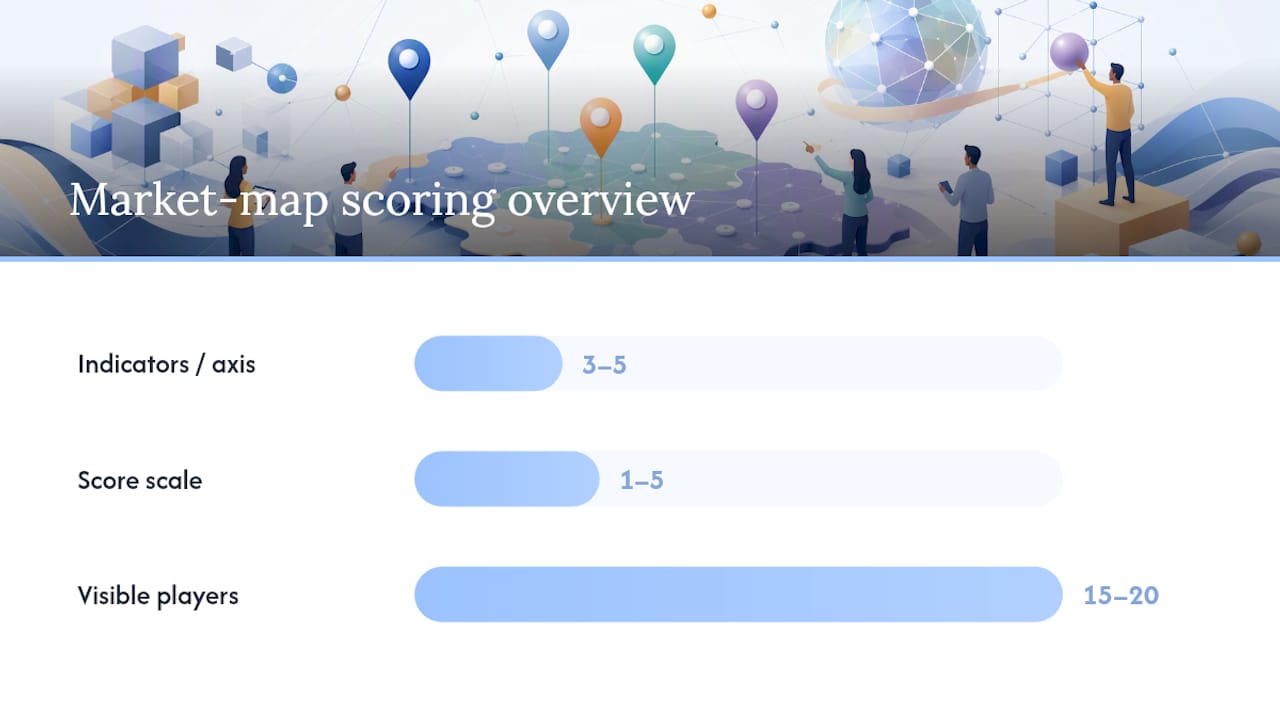
Step 3: Define 3 to 5 measurable indicators per axis. For a "product breadth" axis, indicators might include number of integrations, feature count, and platform coverage. Score each indicator 1 to 5 using explicit criteria you write down in advance, average the indicator scores per axis, and optionally weight axes to reflect strategic priority. This is the scoring rubric construction that separates a defensible map from a guess dressed up as analysis.
Step 4: Gather data across at least five sources. Practitioner advice points to company websites, ad libraries, customer reviews, CRM records, and funding or hiring signals as the minimum spread. Free-text review fields are often the most honest source in the pile, since they surface real strengths and complaints rather than marketing copy.
- Company websites and pricing pages for positioning claims
- Ad libraries for messaging emphasis and campaign cadence
- Review sites for unfiltered sentiment
- CRM win/loss notes for what actually closed deals
- Funding and hiring data for momentum signals
Step 5: Plot, label, and cap for readability. Cap visible players at roughly 15 to 20 so the chart stays legible, label quadrants in buyer language, and set a refresh cadence before you file the map away.
Indicator scoring at 3 to 5 measures per axis, run through a consistent 1 to 5 rubric, is the specific method Oscom's mapping guide recommends for making maps repeatable across teams and time periods, rather than a one-off exercise that nobody can reproduce next quarter.
How Do You Keep a Market Map Accurate Over Time?
Treat every map as a living system, not a slide you finish once. A quarterly refresh cadence is the baseline practitioner guidance recommends, with ad-hoc updates triggered by a competitor's funding round, a major product launch, or a pricing change you spot mid-quarter.
Validation tactics keep the map honest:
- Run win/loss calls after closed deals to check whether your axes still match what buyers actually weighed.
- Scan customer reviews quarterly for language shifts in how competitors are described.
- Watch CRM signals for accounts that moved segments without anyone updating the map.
- Check ad libraries periodically for messaging pivots that signal a competitor's new positioning bet.
Annotate movement directly on the map rather than rebuilding it from scratch. An arrow showing a competitor's shift toward enterprise, paired with a short note on the "market gravity" observed over the past 12 months, turns a static chart into a record of direction.
Pro Tip: If a whitespace segment keeps showing up empty quarter after quarter, validate demand with a handful of customer calls before your team spends budget chasing it. An empty quadrant sometimes means nobody has built the right solution yet, and sometimes it means nobody wants one.

Turning Maps Into Slides Without the Manual Grind
Every practitioner hits the same wall after the analysis is done: turning a scored map into a presentation-ready slide eats hours that should go to strategy, not formatting. What teams actually need is verified company data, clean logo assets, and a fast way to export into PowerPoint without hunting down each competitor's branding by hand.
Quikturn was built around exactly that gap. It draws on a database of over 17 million verified company logos and market intelligence records, so pulling accurate names, domains, and tickers into a map doesn't mean a dozen browser tabs. The platform exports directly into native PowerPoint format, and the same data is accessible through an API for teams who want to build mapping into their own internal tools rather than working slide by slide.
Why Layering Beats Standalone Lists
The mapping mistake we see most often is treating each format as a one-off exercise instead of a stack. A segmentation map alone tells you where the market sits. A buying-signal map alone tells you who's moving right now. Combined, they tell you who's moving and where they fit, which is the actual input outbound teams need.
Getting started takes less than a fresh analytics platform. It takes CRM access, a product owner who can validate axes, and a marketing owner who can keep signals current. Maps that sit in a folder and never touch a call script or a campaign brief were never worth building. A map's only job is to change what someone does next.
— Quikturn Team
Build the Map, Then Build the Deck in Seconds
Once the scoring rubric is filled in and the quadrants are labeled, the last mile is turning that analysis into a slide your team can actually present, and that's where most of the manual grind lives. Quikturn is built for exactly that handoff: search its database of over 17 million verified company logos and market intelligence records, drop accurate names, domains, and tickers straight into your map, and export the finished chart into native PowerPoint format instead of hand-formatting boxes and logos one by one.
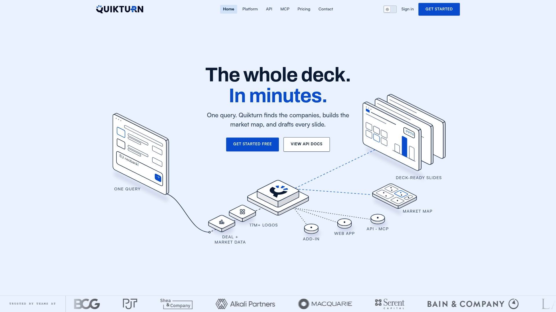
Investment banking and consulting teams use it to move from raw data to a pitch-ready market map without the usual back-and-forth with a design team, and developers can integrate the same logo and company data through Quikturn's API or MCP server for AI agents if mapping needs to run inside an internal tool rather than a slide deck. Quikturn's free tier lets you test the workflow with no commitment, and paid plans start at $9.99 a month for Platform Pro with API access starting at $45 a month for teams that need programmatic search. Check the pricing page for the full breakdown, or get started with the free tier today.
Sources
For deeper reference on the methods covered here, start with Infomineo's practitioner guide to competitive landscape analysis for format selection, Oscom's market map creation guide for the scoring rubric and axis validation steps, and Reachly's nine B2B mapping examples for a free starter template covering segment, tier, stage, and score fields. For financial services specifically, Omnivance Media's industry breakdown shows how mapping applies to fintech and banking GTM strategy.
- Market Mapping: The Practitioner's Guide to Competitive Landscape Analysis | Infomineo
- Oscom
- Market mapping examples: 9 B2B maps that build a predictable pipeline | Reachly
- What Is Market Mapping? (Plus Benefits and Approaches) | Indeed
FAQ
Can You Provide an Example of a Market Map?
A common example is a 2-axis positioning chart plotting competitors by price and implementation speed, with quadrants labeled for the buyer type who fits each corner. Other widely used formats include TAM segmentation maps, buying-committee role maps, and ABM territory maps, each suited to a different strategic question.
How Do You Create a Market Map?
Start by defining the strategic question you need answered, then choose axes based on actual buyer criteria rather than generic labels. Define 3 to 5 measurable indicators per axis, score competitors on a 1 to 5 rubric, gather data from at least five sources, and plot the results with quadrants capped at 15 to 20 players for readability.
What Are the 7 Types of Markets?
Economics texts sometimes group markets into categories like perfect competition, monopoly, oligopoly, and monopsony, but that framework answers a different question than B2B market mapping does. For go-to-market work, the more useful breakdown is the nine practical map types covered above, which sort by strategic use rather than economic structure.
What Are Some Examples of Maps Used in Business Strategy?
Beyond market maps, strategists commonly use SWOT analysis, customer persona maps, and journey maps alongside competitive positioning charts. Layering a market map with a SWOT or persona set tends to sharpen both tools, since the market map supplies the competitive context that a standalone SWOT often lacks.
What Should I Use to Build and Export Market Maps Quickly?
Any spreadsheet or whiteboard tool works for the analysis stage, but exporting a finished map into a client-ready or board-ready slide is where most teams lose time. Quikturn addresses that specific step with verified company logos and data pulled directly into native PowerPoint format, available through its web platform or API.